Friday, April 17, 2015
Thursday, April 16, 2015
Toned.
Music:
1. "Volatile Reaction" Kevin MacLeod (incompetech.com)
Licensed under Creative Commons: By Attribution 3.0
http://creativecommons.org/licenses/by/3.0/
2. "Stormfront" Kevin MacLeod (incompetech.com)
Licensed under Creative Commons: By Attribution 3.0
http://creativecommons.org/licenses/by/3.0/

Final editing
I have been editing on Windows Movie Maker because it is the program that I have the most access to at home.
This past week I have been trimming various of the clips within the documentary in order to make them fit nicely. I ended up sticking to the two royalty free songs that I found online and I managed to incorporate them into most of my documentary.
I'm also putting some final touches on my website and trying to make it look professional. I made a Twitter for my documentary two days ago and have been adding pictures to the website constantly.
Tuesday, April 14, 2015
Documentary progress and research
As I am finishing up my documentary, I decided to research a bit more and read some tips from professionals.
I ran into an article about Michael Moore and his 13 rules for making a documentary film on IndieWire. I was able to learn a lot from just one article and highly recommend it to others.
http://www.indiewire.com/article/michael-moores-13-rules-for-making-documentary-films-20140910
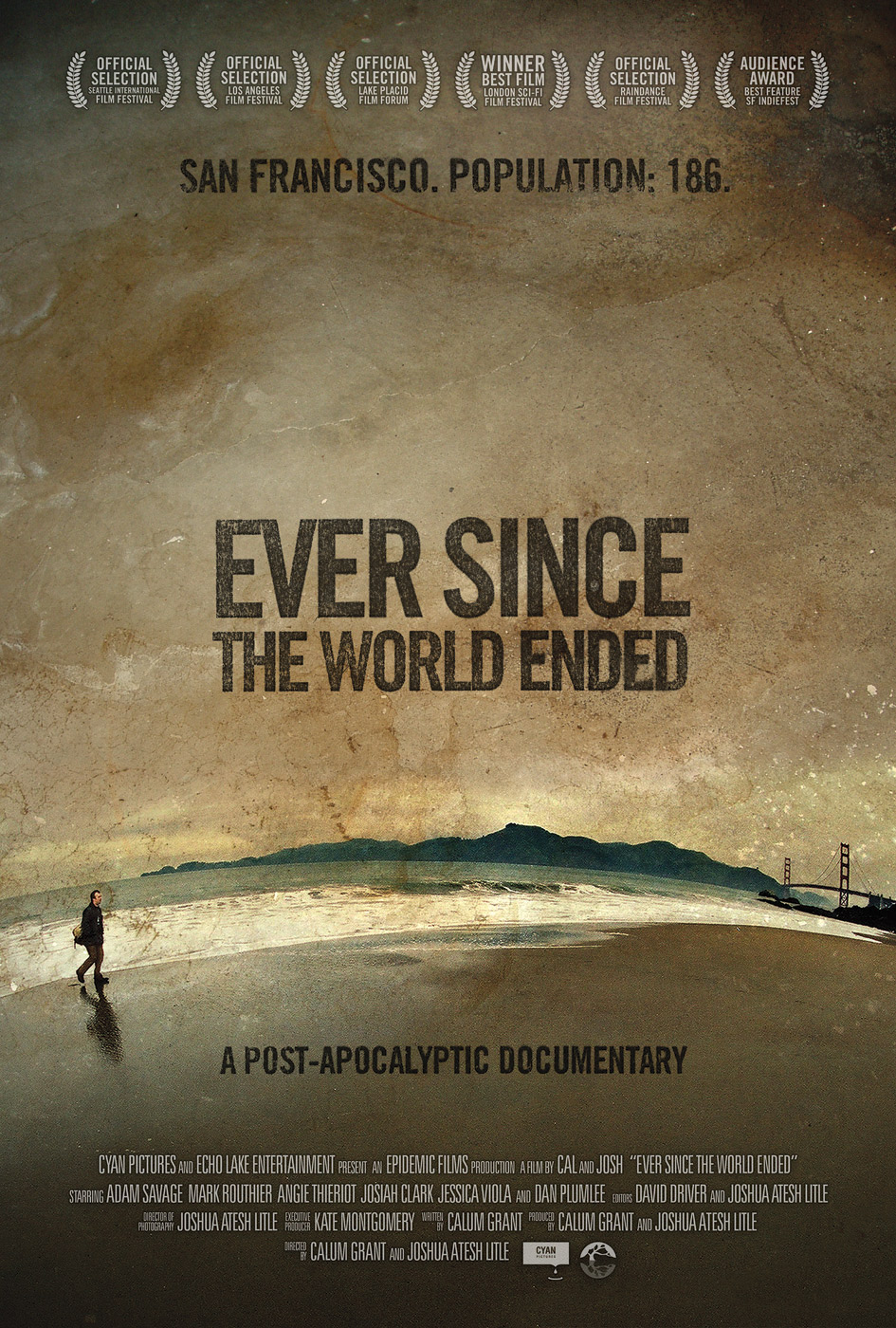
I am also finishing up my poster for the documentary. I have seen various other posters aside from the ones I found last week. I chose to use the poster for "March of the Penguins" for reference since my teacher, Ms. Stoklosa, has a physical copy of the poster.
Lastly, I created a website for my documentary on wordpress. While I am not very familiar with the program, I have been able to slowly add things that will hopefully make the website look complete and professional.
I ran into an article about Michael Moore and his 13 rules for making a documentary film on IndieWire. I was able to learn a lot from just one article and highly recommend it to others.
http://www.indiewire.com/article/michael-moores-13-rules-for-making-documentary-films-20140910
I am also finishing up my poster for the documentary. I have seen various other posters aside from the ones I found last week. I chose to use the poster for "March of the Penguins" for reference since my teacher, Ms. Stoklosa, has a physical copy of the poster.
Lastly, I created a website for my documentary on wordpress. While I am not very familiar with the program, I have been able to slowly add things that will hopefully make the website look complete and professional.
Saturday, April 11, 2015
Editing, editing, editing
I have managed to realize that technology is not always on my side.
I began editing 4 different times, and all 4 of those times something went wrong and I lost all of my work.
I decided to use a different computer to edit and I have now been editing for 3 hours. I hope that my progress actually saves when I click save!!
I'm really seeing the documentary come together and I'm very happy with how it looks. Everything is in order as of now, I just need to fix up some details and add some more music.
YEAH ROYALTY FREE MUSIC!!!
I've been trying contact multiple companies in order to get permission to use their music, but I've had no luck.
I decided to start looking for royalty free music instead.
The websites and options are endless and I couldn't find something that felt right.
FINALLY, after hours of browsing, I managed to find two songs that could fit well with my documentary. I am still on the hunt to see if I find something better, but for now I am very satisfied!
I found the music on this website:
http://incompetech.com/music/royalty-free/index.html?collection=044&Search=Search
Wednesday, April 8, 2015
Technical Issues
I have dealt with more technical issues than I expected. I filmed all of my footage for my documentary on my iPhone and when I transferred the videos onto my computer, I realized it was all wrong. I made a huge mistake filming the shots which ended up making them look very low quality. I tried fixing them by downloading different programs, asking around, and trying to research solutions, but nothing worked.
I ended up having to re-film every part of my documentary.
Though it wasn't planned and I was very frustrated, I was able to re-think some of the shots I wanted to get and in the end I think it only made my filming better.
Now on to editing and figuring out if I need to film more.
Progress with poster
As I began photographing for my documentary poster, I knew for a fact that I did not want a person's face in the picture. My documentary includes two people that play a vital role so it wouldn't make sense to have just one person on the poster and having both would just make it too simple.
I played around with various angles and locations and ended up taking multiple photographs of bars and weights at the gym. My documentary focuses on what the gym, but not just the fact that people go there to look good, rather, how others use it as a foundation for bigger dreams. The people I am interviewing have different aspirations, but training at the gym is what they both have in common. Due to that, I decided I wanted the poster to include the gym.
After hours of trying to take the ideal pictures, I have found the picture for my poster.

I definitely need to do some editing to enhance the quality, but it is absolutely what I was going for.
I played around with various angles and locations and ended up taking multiple photographs of bars and weights at the gym. My documentary focuses on what the gym, but not just the fact that people go there to look good, rather, how others use it as a foundation for bigger dreams. The people I am interviewing have different aspirations, but training at the gym is what they both have in common. Due to that, I decided I wanted the poster to include the gym.
After hours of trying to take the ideal pictures, I have found the picture for my poster.
Documentary- Poster Research
My documentary will also be based on fitness and health. It has a slight twist regarding what kind of a foundation the gym sets for some compared to others. I am pretty familiar with the topic due to personal experience and the research I did for my magazine.
Today I began researching how to create the poster for my documentary.

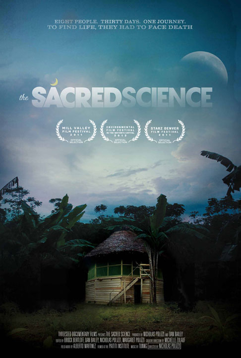
These are my favorite documentary posters that I found during research. I have come up with multiple tag lines that I will include in my poster aside from the title. I have definitely decided that my documentary will be titled "Toned." All of these have a different placement for the title and tag-lines. My decision on where to put these will be in accordance to what the picture I choose for my poster looks like.
I will be taking pictures for my poster tomorrow afternoon.
Friday, April 3, 2015


Finishing the magazine
I'm at the point where I am simply looking over every part of the magazine and fixing up anything I can.
I am making sure that everything I have designed is in high quality mode and looks good. I was reviewing my table of contents and decided to completely change one of the main pictures I had showcased. This was mainly because of quality, I felt as though that one picture was not as high quality as the rest, regardless of editing.
I also fixed the font in my two page spread because I didn't like the flow of it around the page. I used one of the fonts that I downloaded from dafont.com called 28 days later. Since my two page spread has a lot of text, I wanted to avoid having it look boring so I played around with underlining specific words that needed to stand out.
I'm really proud of my magazine as a whole and I'm impressed with everything I was able to create. I feel as though I really put my all into this layout and I hope it is evident to people reading it.
Wednesday, April 1, 2015
Final touches
I am putting the final touches on my cover page and table of contents page. I am thrilled with how it looks.
The cover looks awesome and I am so happy with the way everything seemed to fit in. The title is placed exactly the way I wanted it to be and it took so long to get it just right.
The table of contents page is just right in my opinion. I used some inspiration from similar magazines but kind of put a twist on it. It ended up being simple but not too simple which is exactly what I was going for. I was able to fit in a couple of pictures that help illustrate what the main stories are about.
As for the two page spread, I am almost done. I have to add some more text that I just received along with a link to a video and that's basically it.
I am so satisfied that all my hard work is really paying off and that I am happy with the way everything looks.
Tuesday, March 24, 2015
Two Page Spread
I'm a little bit frustrated because I can't think of the right layout for my two page spread. I've tried various designs but nothing seems right. I have decided that the story will definitely be "Ask the personal trainer" but I'm not sure how to present this story. Since this is more of a body building magazine, it is aimed towards men. This has caused me to have some trouble thinking of a design that is more on the simple side, but not overly simple.
For the actual content on the two page spread I have questions and answers, a little bit of background information, and even a recipe that is recommended. This is all already written on the two page spread, now I am just trying to format and make a layout that feels right.
I have started placing the picture of the nutritionist/personal trainer that I showed in a previous post and it all seems to be working well. I am trying to just take it from there.
Progress
I've made some great progress. I was able to finish up my cover and I'm really happy with it.
I decided to carry out my color scheme throughout all of my magazine, making it all black and green. I was able to make the shade of green the same one as one of the ropes that is being held in the pictures I took. Being able to match the green I used in my layouts to the green in the picture is what really convinced me to continue this color scheme.
I realized I really needed some more pictures for my two page spread and table of contents. I didn't want the pictures to just be of a person so I will try to get some pictures of work out equipment and protein shakes. These are all things that are mentioned within my magazine so I feel as though they should be represented through pictures too.
The cover ended up being a little bit different than I planned but overall it came out even better than I expected.
I decided to carry out my color scheme throughout all of my magazine, making it all black and green. I was able to make the shade of green the same one as one of the ropes that is being held in the pictures I took. Being able to match the green I used in my layouts to the green in the picture is what really convinced me to continue this color scheme.
I realized I really needed some more pictures for my two page spread and table of contents. I didn't want the pictures to just be of a person so I will try to get some pictures of work out equipment and protein shakes. These are all things that are mentioned within my magazine so I feel as though they should be represented through pictures too.
Thursday, March 19, 2015
Two page spread
Today I continued to photoshop some pictures that I will include in my two page spread.
I have also decided that my two page spread will be a sort of advice column where you can ask a nutritionist questions. I have collected a variety of questions from friends and family that they would be interested in asking a nutritionist and sent it Jose Vallejo who will be the featured nutritionist.
I sent the questions today and expect the responses back by later today or tomorrow. From there, I will be choosing what questions/responses I'm going to include on my spread.
I also asked for some random tips that can be included on the page so that it's not just questions and answers.
A small area of the spread will be dedicated to giving some information on the featured nutritionist, giving some background information, etc. This way, people will know a little bit about the person they are receiving advice from.
This is the picture of Jose Vallejo that will be included along with the information about him.

I'm excited to add the information and continue working on the spread.
Progress editing pictures
I'm so happy with my progress so far.
I managed to take a couple of pictures in my garage. The back drop wasn't the best but it was the only thing I had available that would make the background black.
Yesterday and today I have focused on editing some of the pictures of photoshop, including my cover picture.
I'm really happy with the way the cover is looking- I also found the perfect font for my title.
Now I'm trying to focus on setting up my cover lines.
As for the color choices, I think I'm going to stick to green, black, and white. After testing various combinations, those are the colors that match best with the pictures I have taken and will continue to take.


Wednesday, March 11, 2015
Table of Contents research
I found a very informative article explaining how to make a Table of Contents page.
This article explains how to create a TOC page by using the program InDesign which is one of the programs that is available to me.
The explanation used to describe a table of contents page in this article gave me the idea to include advertisements that surround the actually stories. I will include the advertisements by entering them in a hidden layer and later including them in the TOC, as recommended by the article.
(Creating a table of contents. (n.d.). Retrieved March 11, 2015, from https://helpx.adobe.com/indesign/using/creating-table-contents.html)

 (May/June 2014 Table of Contents. (n.d.). Retrieved March 11, 2015, from http://www.eatingwell.com/food_news/eatingwell_magazine/current_issue/mayjune_2014_table_of_contents)
When it comes to actually listing the page numbers and stories, this is a format that I would look to follow. The picture of this TOC page from a Health and Wellness. While I may not be looking to use the same simple font, the general format is what I am looking for. This type of format will be surrounded by multiple images, more than likely including a few advertisements.
This article explains how to create a TOC page by using the program InDesign which is one of the programs that is available to me.
The explanation used to describe a table of contents page in this article gave me the idea to include advertisements that surround the actually stories. I will include the advertisements by entering them in a hidden layer and later including them in the TOC, as recommended by the article.
(Creating a table of contents. (n.d.). Retrieved March 11, 2015, from https://helpx.adobe.com/indesign/using/creating-table-contents.html)
When it comes to actually listing the page numbers and stories, this is a format that I would look to follow. The picture of this TOC page from a Health and Wellness. While I may not be looking to use the same simple font, the general format is what I am looking for. This type of format will be surrounded by multiple images, more than likely including a few advertisements.
Additional research for magazine cover
I have been brainstorming on different types of shots that could be used for my cover. I have decided that it'll definitely include a single person engaging in some sort of action. Most likely lifting a type of weight. As for the color scheme, I have found that black and yellow is very powerful, therefore, I might lean towards including those colors more- especially for the cover.


"Yellow - is the most visible color and is the first color the human eye notices! Yellow, the color nearest to "light" leaves a warm and satisfying impression, lively and stimulating and in many cultures symbolizes deity. Dark yellow can be oppressive while light yellow is breezy. Yellow's stimulating nature and high visibility to the eye is the reason why many road signs are bold yellow (contrasted by black text). Yellow birds, flowers and skies are sure to be eye-catchers just because of the way the mind and eye works!"
-The Psychology of Color. (n.d.). Retrieved March 6, 2015, from http://www.moosepeterson.com/techtips/color.html
Each magazine issue will be covering a specific type of exercise or body part. This will she accentuated by the cover image and the cover lines.
As for the header, I think I will include it in the center of the magazine cover. The image that makes up the cover will be placed in front of it, most likely covering a portion of the title of the magazine.
Thursday, March 5, 2015
Magazine Article Ideas
After researching a few more magazines pertaining to my topic, I have decided I will include articles regarding meal plans. These will include what you should eat before and after a workout in order to get the most out of workouts.
I think this addition and overall topic would have success due to the growing relevancy in today's society as more people to get fit and healthy.

 I'm considering interviewing a nutritionist in order to obtain information regarding the meal plans. I have seen this done in Shape magazine and bodybuilding.com. The colors I will potentially include for the layout of this article will be bold and passionate.
Along with the meal plans, I will include multiple tips in order to motivate readers.
I think this addition and overall topic would have success due to the growing relevancy in today's society as more people to get fit and healthy.
Along with the meal plans, I will include multiple tips in order to motivate readers.
Magazine Cover Research and Ideas
For my AS Level project magazine layout, I wanted to do a topic that is relevant and becoming more popular in society. Fitness and Health are two things that I have grown to love and I share the passion with various family members. This topic has also gained popularity recently and has become more prominent in today's society.
 I've started looking up various and health and fitness magazines and came across multiple themes that I appreciate.
My cover is going to be bold since the magazine will be focusing on different routines and tips to follow in order to gain muscle, be lean, and get toned.
I have started looking for fonts on dafont.com. I was recently introduced to the website and have found multiple font possibilities that would really come across as bold.
As for color schemes, after looking at other health and fitness magazines and body building magazines I will be leaning towards shades of green and blue.

Subscribe to:
Posts (Atom)